
Our New Brand Identity

Our new name, badge and logo reflect the unified efforts made by Mississippi Rush, Brilla Juniors and BFC to take the next step for near-term and long-term future success of youth soccer in Mississippi.
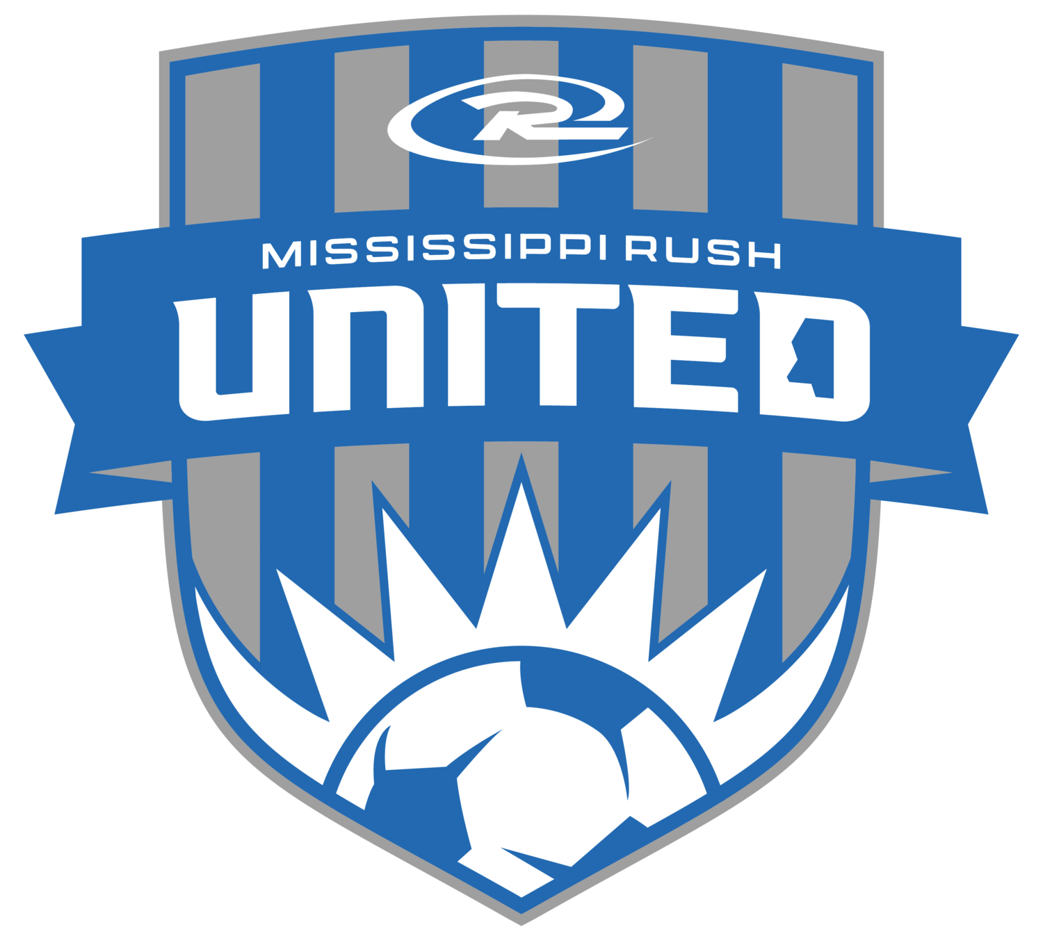
We took elements from all three club identities to create the new brand for MS Rush United.
The shape of the crest is an adaptation of the Brilla crest with slight tweaks similar to the BFC crest.
We take the sun feature from Brilla's crest and incorporate it as a primary feature.
We take the ball from BFC's crest and bring it as a featured element into the new one.
As a nod to Brilla & Rush's uniforms, we use stripes in the crest to show another foundation of the new club.
We've incorporated the shape of the state of Mississippi in "D" of UNITED to signify the united efforts of our clubs in our mission to better youth soccer in our state.
Visually, we want UNITED to be the primary focal point of the crest, so we give it the most prominence with a dynamic type treatment to compliment the movement of the RUSH logo. The banner is added as an element for new and current players and families to take pride in the coming together of the three clubs.
Upper focal point is the primary Rush Logo, required to be featured in all club crests.
MS RUSH UNITED STORE!
https://www.challengerteamwear.com/store/mississippirushunited/index